Introduction

Cannabis Pages

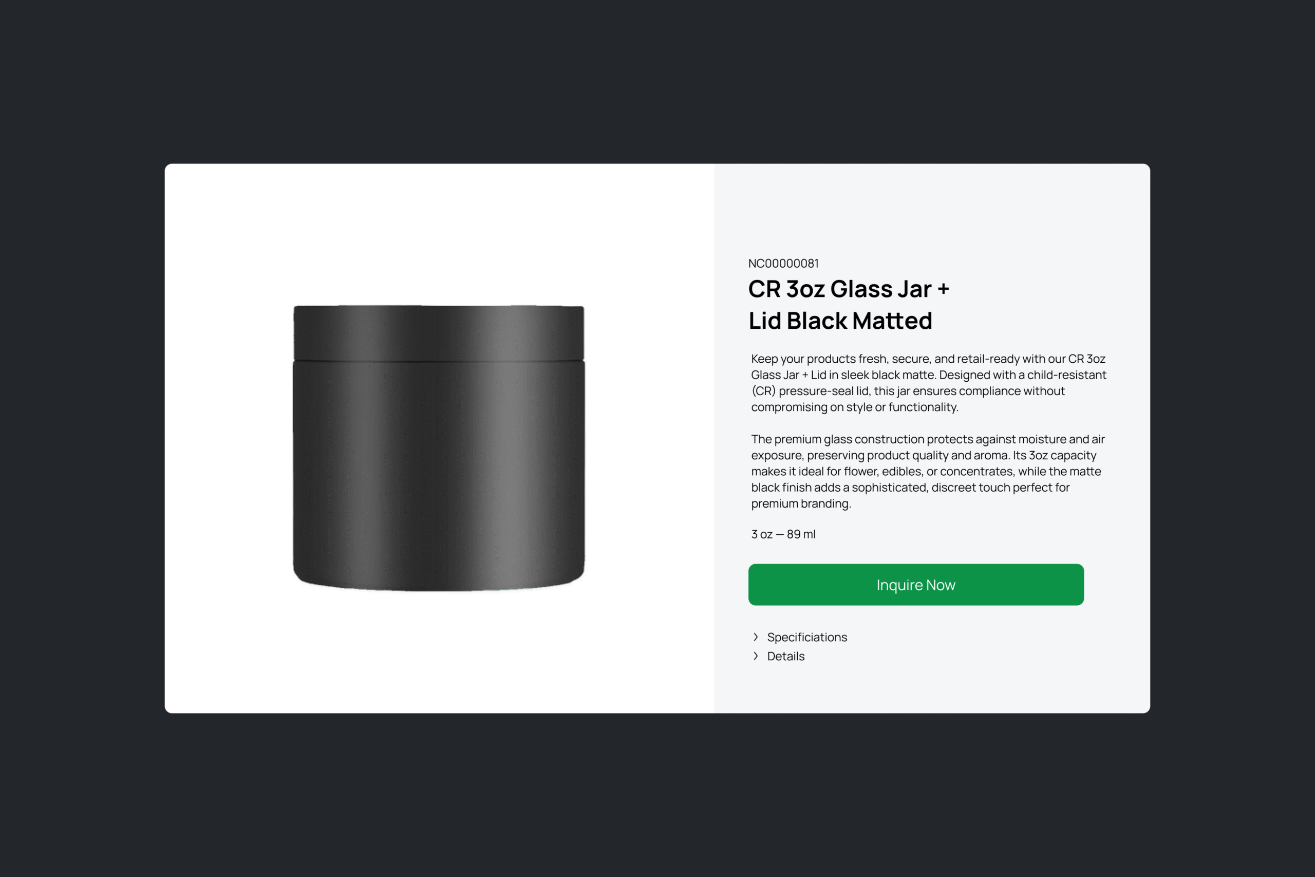
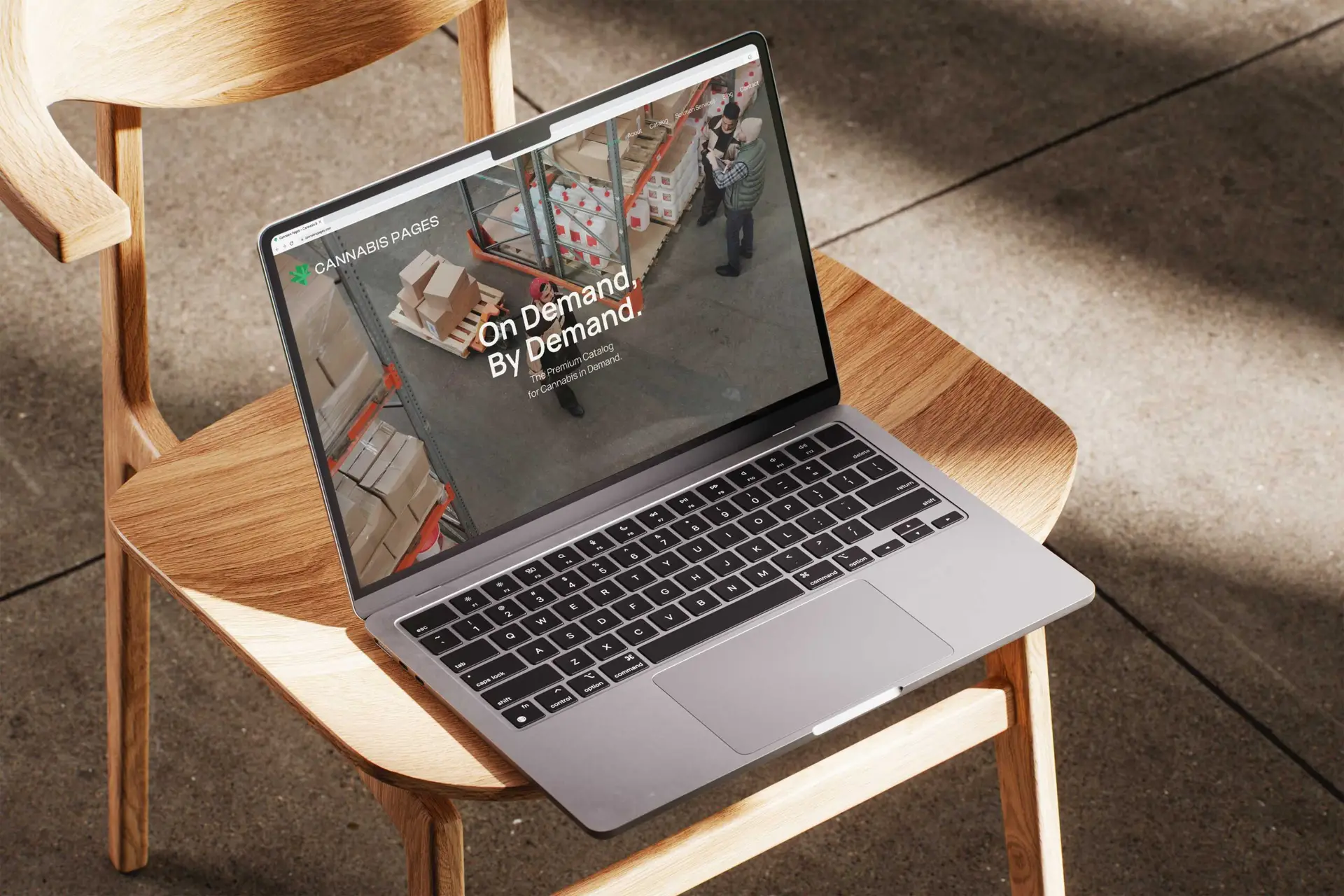
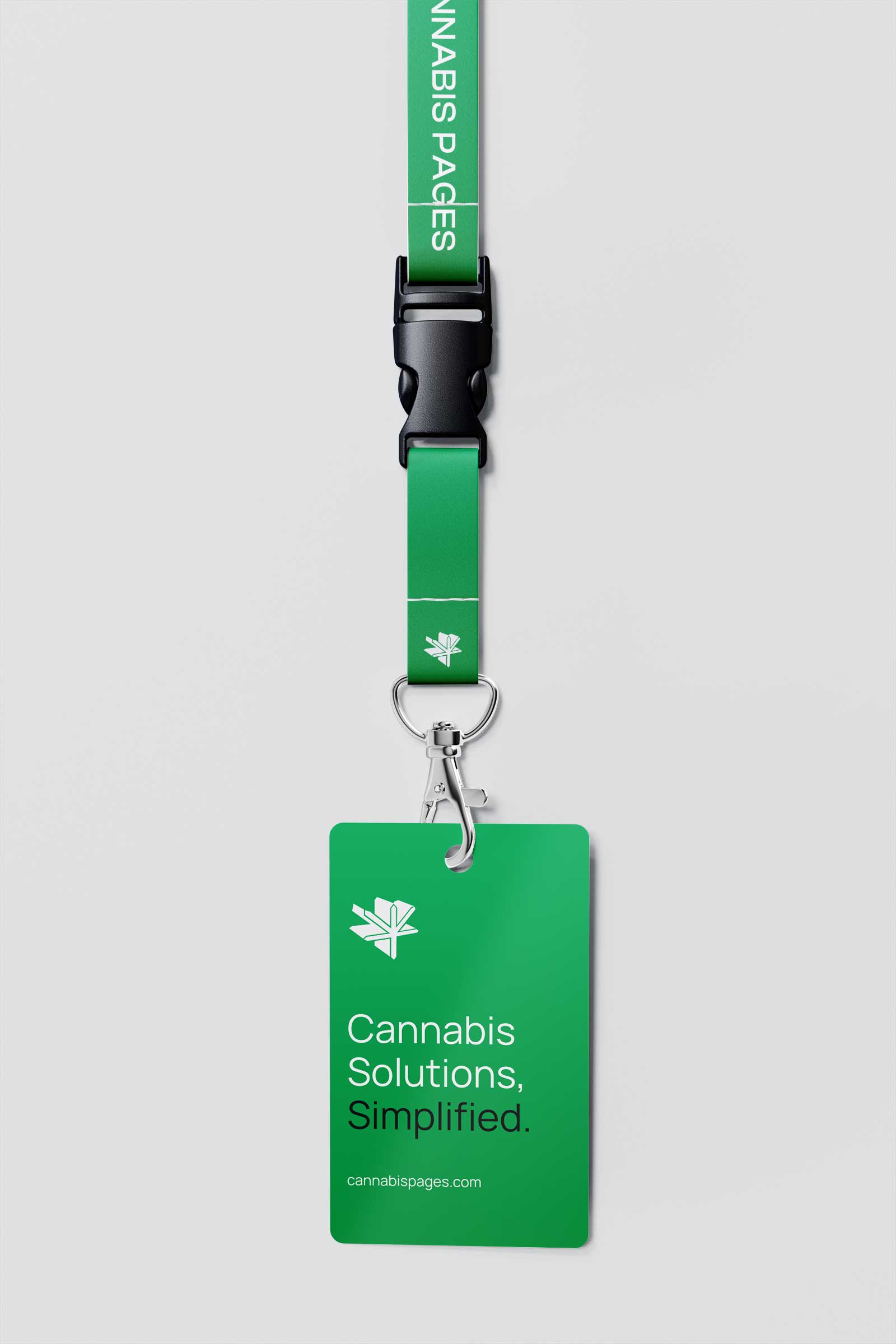
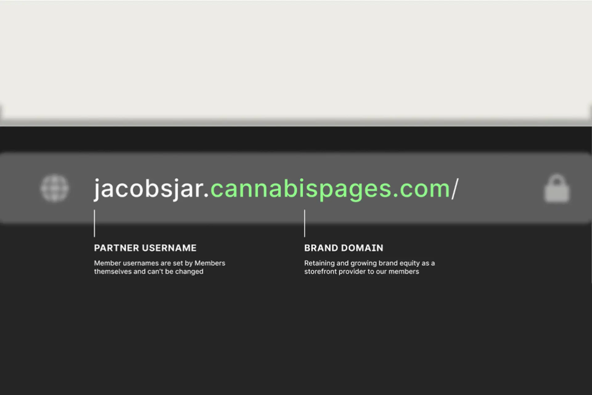
Cannabis Pages is a B2B marketplace built to simplify how licensed producers, retailers, and packaging suppliers connect within the cannabis industry. The platform brings together certified packaging, facility equipment, and essential services in one trusted space for professionals. My role was to shape an identity and digital presence that communicate clarity, confidence, and expertise in a market that continues to evolve.

The cannabis industry is expanding quickly but remains fragmented. Many businesses struggle to navigate regulations, source compliant packaging, or find reliable partners. Cannabis Pages needed more than a directory; it needed a clear and credible identity that could bridge that gap. The challenge was to design a brand that feels professional and approachable while positioning Cannabis Pages as both a guide and a leader in the market.

Approach

I began by defining what sets Cannabis Pages apart: reliability, education, and access. The logo was designed to capture that idea, merging the shape of a cannabis leaf with the motion of turning pages to represent both knowledge and growth. The visual language was built around balance, using clean typography, structured layouts, and a distinct palette. On the digital side, the website was designed to deliver information clearly and guide users intuitively through a growing catalog of resources.

Solution

The final identity and platform present Cannabis Pages as a modern and trustworthy marketplace for the industry. The website delivers a clear and organized experience that makes it simple for users to find and connect with suppliers, while the toolkit provides a consistent visual framework for future expansion. Together, they position Cannabis Pages as a brand built on clarity, compliance, and connection, simplifying the cannabis supply chain for businesses across Canada and beyond.