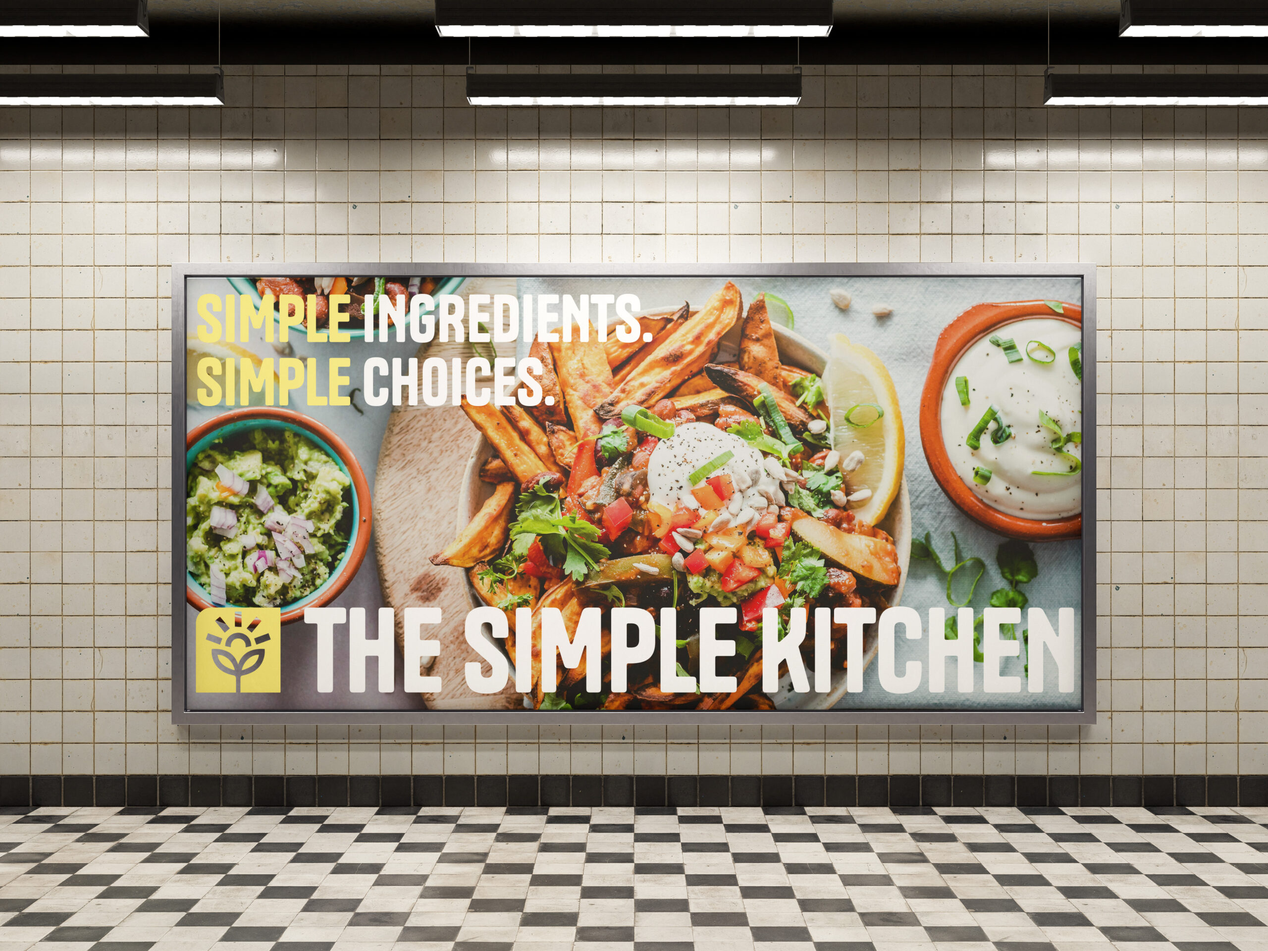
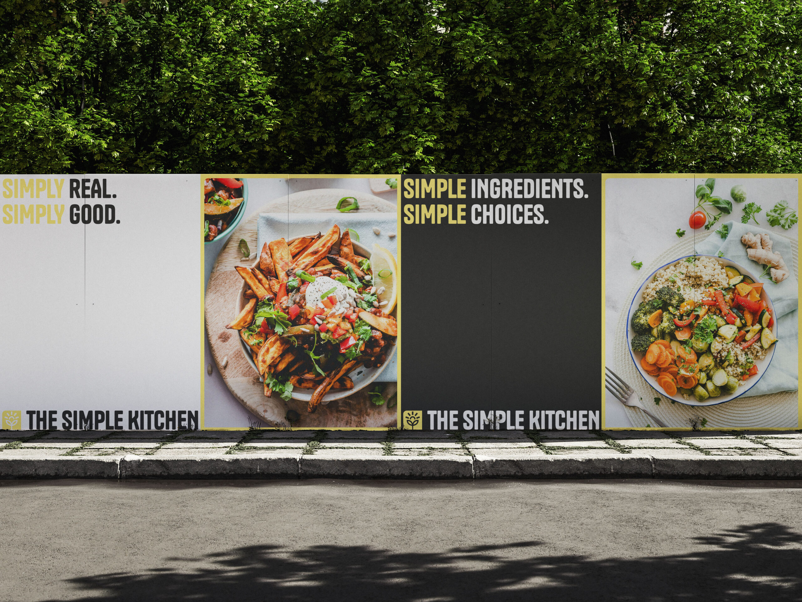
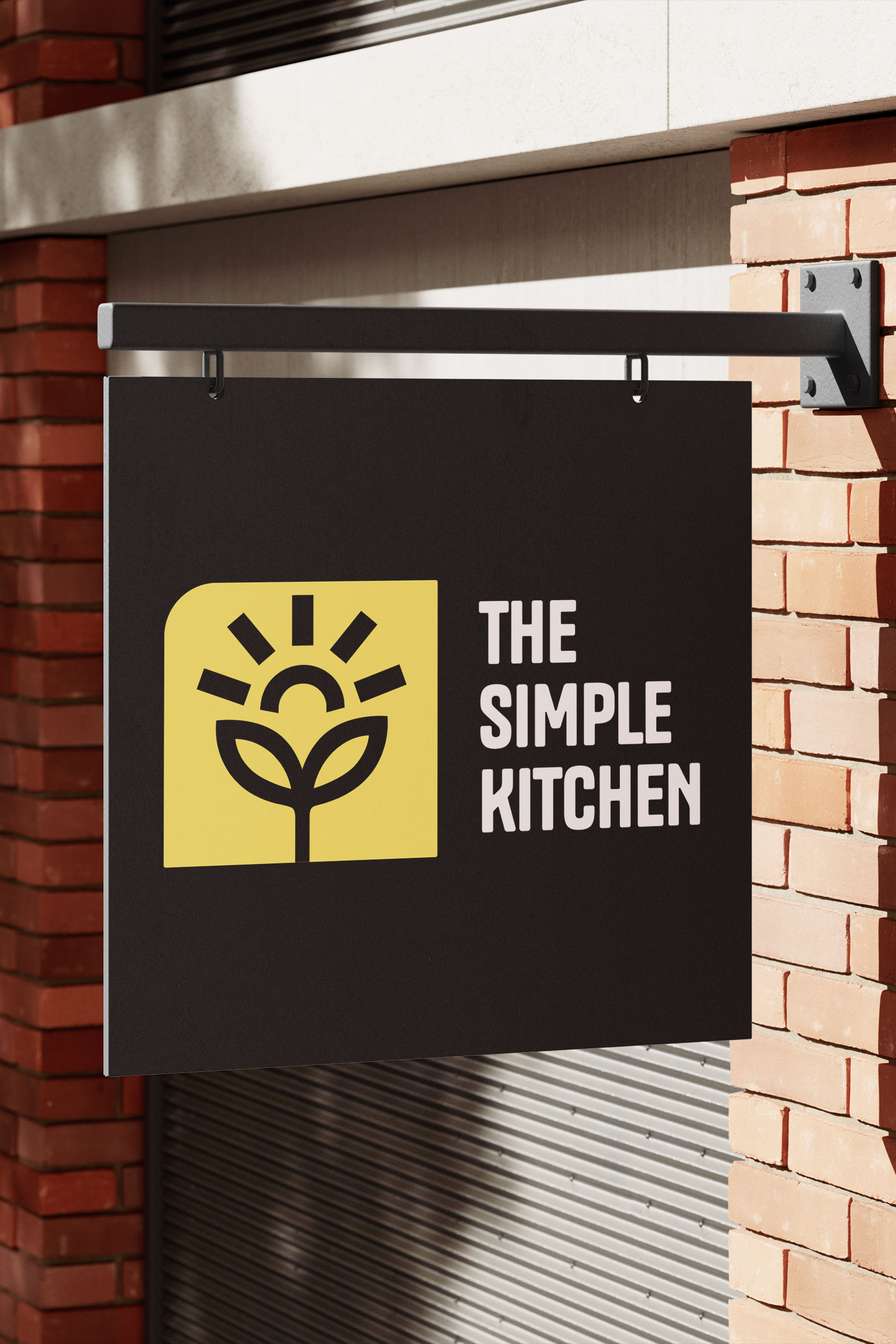
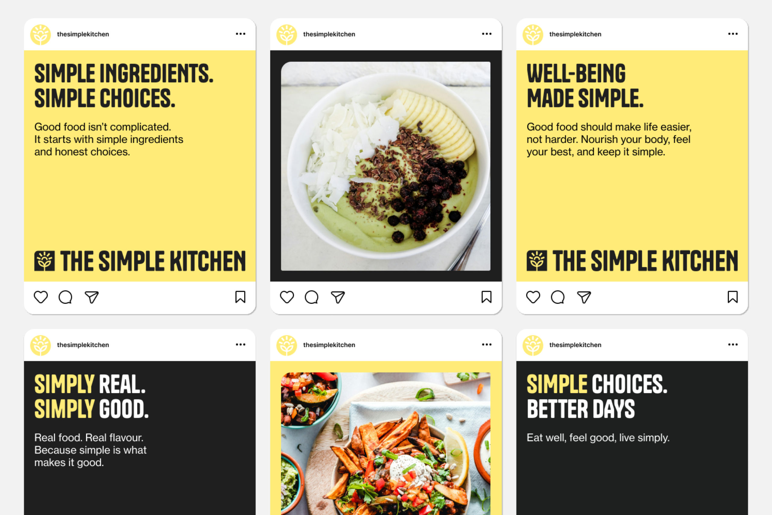
Rooted in preventive well-being, The Simple Kitchen focuses on nourishment without compromise. Built around clean ingredients and mindful living, the brand connects with people who want to enjoy what they eat while taking care of their health. As the community and product range expanded, The Simple Kitchen needed an evolved identity that could carry its philosophy into new channels and wider reach.
The brand had built a strong community and loyal following, but its visual identity wasn’t keeping pace. The system felt fragmented and lacked the warmth and clarity needed to express balance and simplicity at the core of the brand. The products embodied nourishment and vitality. The branding didn’t capture that same confidence.
The challenge was to create a cohesive identity that could translate the feeling of well-being into visual form and unify every touchpoint under one clear voice.