Introduction

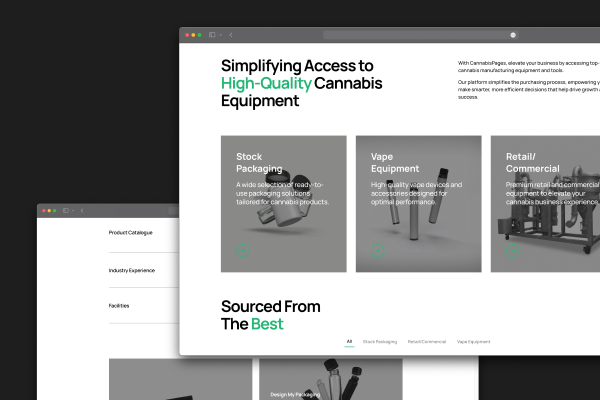
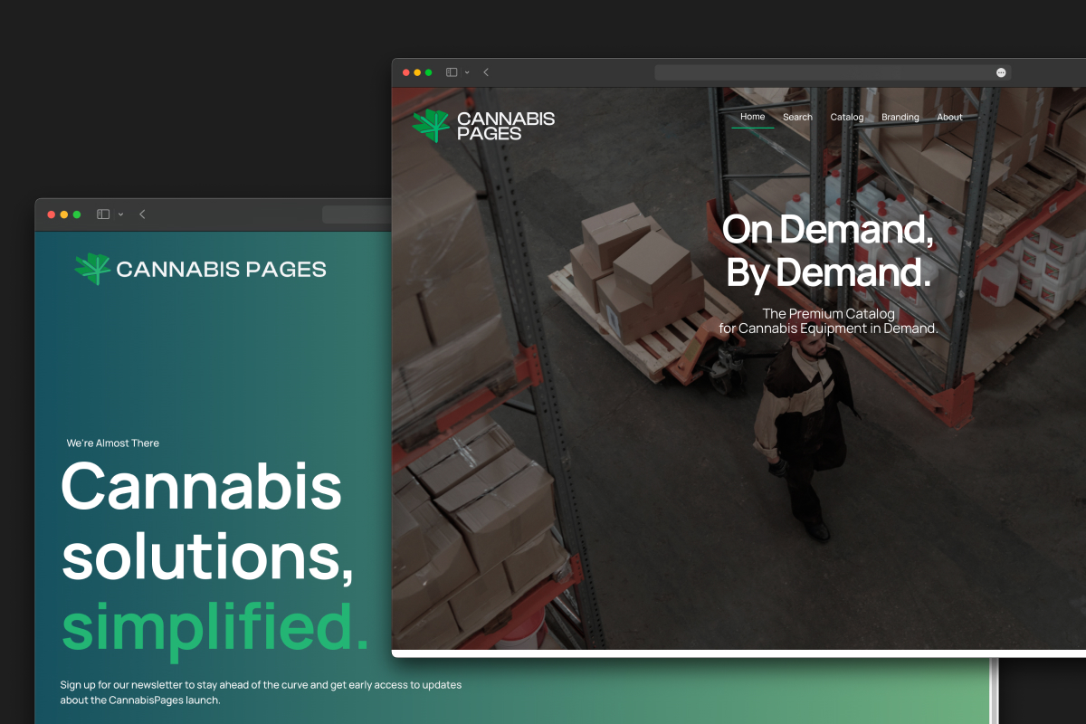
CannabisPages set out to raise the bar in the cannabis industry—making it easier for businesses to access the equipment, packaging, and solutions they need to grow. Their curated catalog brings together certified-compliant packaging, facility equipment, and services ranging from QAP to processing and manufacturing.

My role was to help translate that mission into a brand and digital presence.

Identity Design

The CannabisPages logo blends two core ideas at the heart of the brand: cannabis and resource. The icon is inspired by the form of a marijuana leaf, but reimagined as overlapping, angular shapes that resemble the pages of a book being flipped. This duality communicates both the industry focus and the brand’s role as a resource—curated, educational, and forward-thinking.

Digital Presence

CannabisPages needed a digital presence that matched their mission: simplifying access to high-quality cannabis equipment and packaging. The design emphasizes clarity and trust, with bold typography, clean layouts, and a sharp balance of green accents against neutral backgrounds.

Strategy

Looking ahead, the end goal is to scale the platform so partners can sell their catalogs to even more businesses, making it easier than ever to access the tools and solutions they need. The vision is to create a marketplace that grows with the industry and unlocks opportunity at every turn.

Browse other works

Formulations that understand
and honour melanin-rich skin.

uuanted

Formulations that understand
and honour melanin-rich skin.

A healthy dose of goodness